Digital work: Zombie Girl
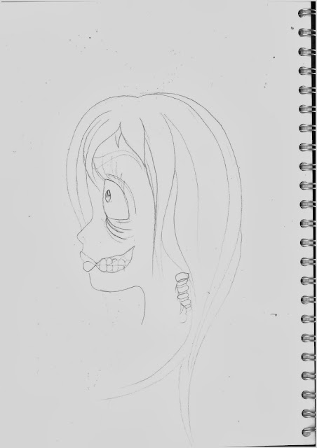 |
| Above: A quick sketch I did of a Disney style inspired zombie girl. Once I had completed this rough sketch I scanned it in to the computer and opened it up in Photoshop |
 |
| This is the piece after I created the outline using a pen tool and making the oval frame from a oval shape tool. Once I was happy with the outline I removed the layer which contained the original sketch. |
 |
| This is the piece as I added base facial colour and started adding tone. I chose green so it showed zombie like qualities, I also made her lips blue to make her look more dead. I added tone in places that would need shade, like the eyes, under the mouth and around the revealing spine and under where the hair would be. I added the base colour with a hard brush and added the tone with soft brushed and used the blend and smudge tool to blend it out. |
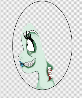 |
| Here I have added more tone and red tone around the flesh around the spine. |
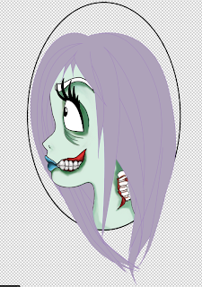 |
| Here I have added tone and colour around the gums and teeth and added base colour to the hair. I chose to use purple for the hair because I think it compliments the green in the face. I added the base hair colour with a hard brush, I also chose a lighter shade of purple as the base so I can add the darker and maybe a few lighter ones on another layer to create tone. |
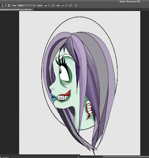 |
| Here is a piece in process of me adding tone to the hair to give the piece more depth and interesting qualities. I added the tone with soft brushes and blended them to make the hair look smooth using the smudge tool and blur tool. |
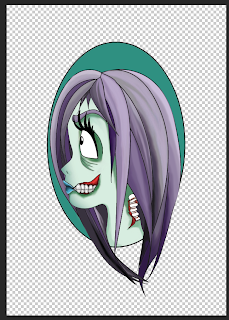 |
| Here the piece is at its final and finished! I have added colour within the oval frame, I chose a green similar to the face to reflect these colours. |
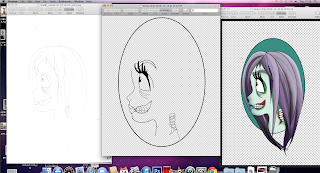 |
| Here is a screen shot of three main stages of my piece to show my development. The first is the original sketch, the second is my outline and the last is the final product. |
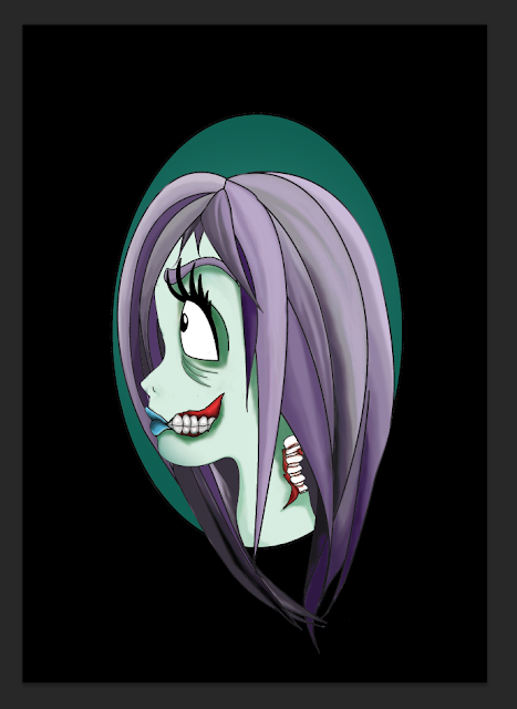 |
| All done! This is the piece all done and I put it against a black background to make the girl stand out more. |


No comments:
Post a Comment