Monday, 6 October 2014

1888 London Scenes

A poster around Whitechapel in 1888 

As I will be painting Whitechapel, London in to the backgrounds of my pieces I will need many references to get a real feel of how the streets of London looking in 1888 when the Ripper struck. In particular I want to look at building like pubs as the prostitutes The Ripper killed would have worked for the local pubs, I will also be looking as the scary back streets and ally ways.

This is a photo taken in 1902, even though taken 14 years after the time of the murders, the streets would still be roughly the same. The pictures show the cobbled road of Dorset Street in London, this picture shows us an example of how the streets were made up of different size buildings crushed together, almost fighting for their space.
While doing some research I found that The Ten Bells Pub in Whitechapel is tightly connected to the case of Jack The Ripper.
This picture shows how the pub looked back in 1888, The Ten Bells Pub is very closely related to The Ripper and his victims. 

And surprisingly its still there and almost identical to the way it was is 1888!

The sign to the famous Ten Bells pub. 

Berner Street, London. 1888.
Hanbury Street.
I have chosen to look at this street as one in particular as it is the street where Annie Chapman, The Rippers 3rd (arguably 4th) murder victim was found. I am going to keep looking in to the streets where the bodies were found as these will give me the best ideas to draw from, keeping my drawings vaguely correct and keep them to history.
The reason I want my pieces to keep to history, is because I feel that if I didn't it just wouldn't be right, I want to get as close to an idea of The Rippers surrounding as possible as if I didn't I don't feel like I would have completed my work right. If i set the scene right I believe everything else will fall in to place easily and the pieces will work in harmony.

Here is a map of Whitechapel 1882 and the names of the victims and the places that the were found. I am going to look up each address and try to find a picture of each street in the rough time area. 
Buck Row - Where the body of Mary Ann Nichols was found


Victorian Male Gloves, Hats and Clothes (Brief research)

As I am drawing the Ripper, I will have to find out what dress would have been typically worn in London 1888 when the Ripper was on his killing spree. As I will not be drawing his face, I will concentrate on items of clothing such as hats and gloves, as this is probably all I will draw of him in the pieces. 
 Here I have found a few pictures of hats, shoes and gloves. They all seem very simple to draw and get an idea of, so looking at these will help me along.


The reason I am choosing not to draw Jack The Ripper in my pieces as a whole character, face and all, is because since 1888 the ripper has been left unknown up until this month (finally the real face behind Jack The Ripper has been revealed and proven) and for most the whole obsession of The Ripper has been because nobody could prove who did the horrifying murders and mutilations. This is probably the only reason that these murders are as well known to this day, because of the mystery. So I would like to keep this up in my work and hide his face, keeping the concept of terrifying mystery alive, and keeping the audience curious and wanting to learn more about the man who stalking in the shadows preying on young women. 

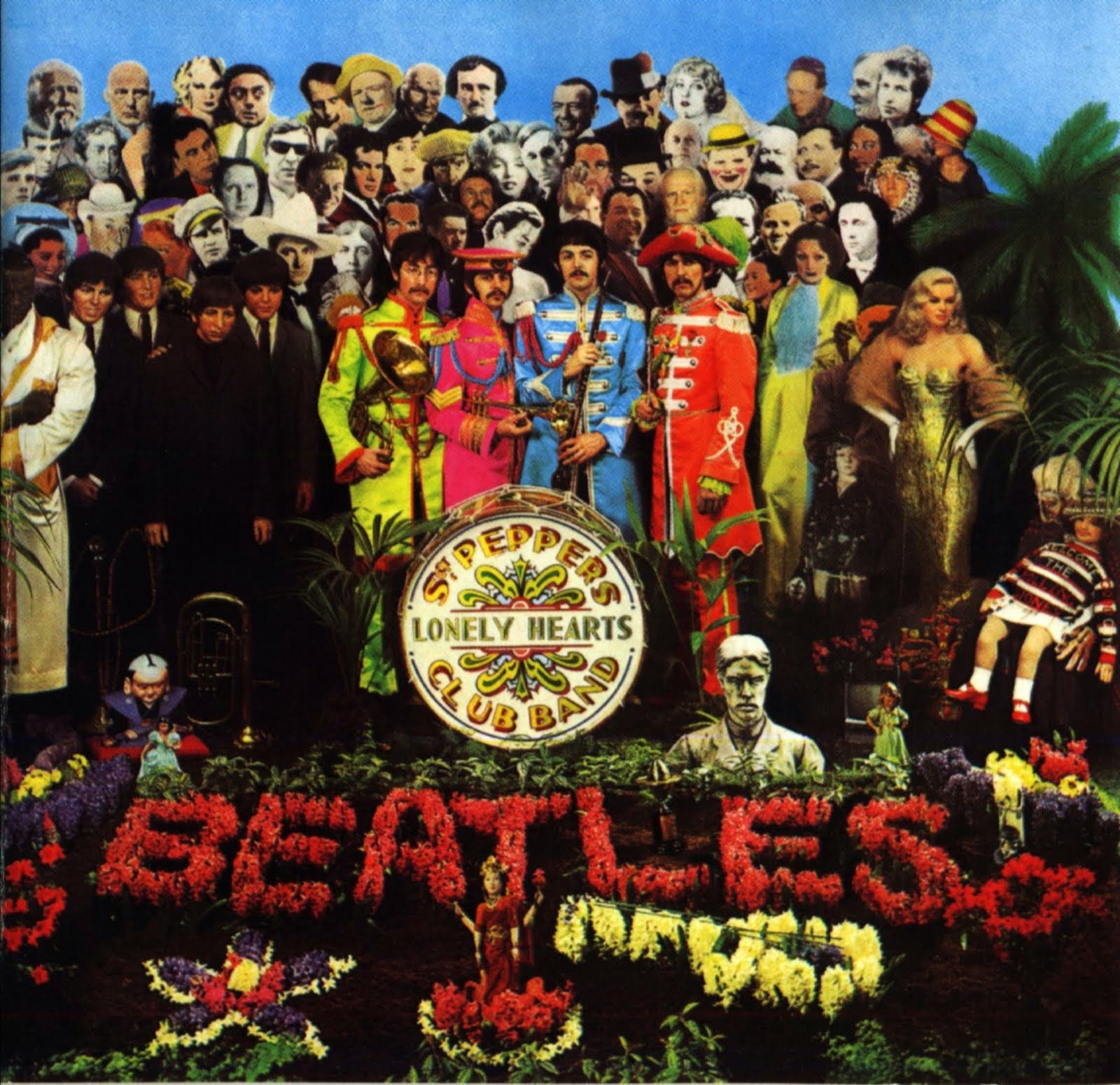
Album art research: Sgt. Peppers Lonely Hearts Club Band

Sgt. Peppers Lonely Hearts Club Band 1967 
Sgt. Peppers Lonely Hearts Club Band was released on the 1st of June in 1967 and was The Beatles eighth album. This album work won the 1967 Grammy Award for Best Album Cover; Graphic Design and the album itself stayed in the Top charts in the UK for 22 weeks and number 1 for 15 weeks in the US. 

The album cover started from an ink drawing from McCartney and this was then given to Pop artist Peter Blake and his wife Jann Haworth to design the final layouts and was directed by Robert Fraser and the final cover was photographed on the 30th of March 1967 by Micheal Cooper. The drum in front of the band members was painted by Joe Ephgrave and the collage includes 57 photographs, 9 wax works and the members of The Beatles.

The characters include; Mahavatar Babji, Lahiri Mahasaya, Bob Dylan, Sri Yukswar, Bobby Breen,Paramahansa Yoganda, Marlon Brando, Marilyn Monroe, Aubrey Beardsley, Albert Stubbins, Sonny Liston, Stan Lauren, H.G Wells, Oscar Wilde, Dylan Thomas and Oliver Hardy.
The purpose of having this massive collection of iconic people was meant to show a wide diversity of people who influenced the world to make it the way it was on that day. On the cover is also wax works of The Beatles as how they looked at the beginning of their career next to the real them as they appeared at that point. This showed the audience a huge distinction between who they were and who they came to be in their lives and careers.

This cover cost nearly £3,000 in comparison to most albums back in 1967 which on average cost around £50. Seemingly worth it as this cover came to change album covers forever, it was a huge leap towards new and different covers expressing different things in off beat and new ways. 

Tuesday, 30 September 2014

Spring Heeled Jack 1905


Here is a piece from a comic book from 1905, with a character looking shockingly like Batman. This comic book is called Spring Heeled Jack - The Terror of London. The piece depicts a Batman like villain on a tombstone scaring a group of men. 

I love this piece, the faded background and colours used clearly point towards victorian London and also the clothes used. The use of light from the lamp that illuminates the tomb stone and the man in the bat suit fits very well, showing the clear pinnacle of the piece. 

Your Vice is a Locked Door and Only I Have a Key (1972)


I love this poster! I find it very capturing, it calls for the audience to look closed to decipher what exactly we are looking at. The way the faces have been painted and smudged down, showing only the bottom faces terrified expression. We can see that the colour palettes of giallo film posters all hold similarities such as mainly black, then reds and yellows and some with a hint of green or blue in highlights or reflections. 

This is probably one of my favourite posters I have seen as of yet, due to the clean cut woman's face looking down in a soft beautiful manner displaying calm in the keyhole against the messy bright blood spatter that sprays out from under the keyhole. Once again the limited colour palette is seen here, with the main black with the accompanying red and yellow. Dramatic!

Here is a photography based poster for this film, as dramatic as the illustrated ones, the half naked woman once again with the calm expression but edgy eyes draw in the audience. Along with the red eyed cat, the poster leaves a lot to the imagination and makes the audience want to watch the film to see what happens. I love the over saturated colours of the background, bringing forward red as a main colour with black once again. 

Death Walks on High Heels (1971)

'Death Walks on High Heels' or 'Le Morte Cammina con i Tacchi Alti' from 1971 is another Italian Giallo film that I have looked in to, I have found three different posters for this film, so I am going to look at each of them and compare.

This first poster has a limited colour palette, I like this effect it clearly portrays that the film is a dark thriller and gives it a dramatic edge. I like the lack of detail, how it only shows elements of the woman in the foreground, choosing to focus on the shoes and a patch of ground they walk on, I think this is very interesting and the colour of the red against the black creates a hard edge. The clear central element of this poster is the red eyes of the man in the background. The eyes take the concentration of the audience straight to them, I love the clear harshness of them and how wide they are, creating an unsettling atmosphere.

Once again we see a limited colour palette even though it is not as limited as the previous. I love the roughness of this poster and the shock of red blood around the woman's neck, the mystery of the person in the suit as his head is turned creates a will in the audience to watch it to find out how and who. 

This poster is much different from the previous two as it is made up from photography or maybe stills from the film. The photographs chosen are perfect for this genre of film. I love the dramatic eyes of the woman, looking right past the audience, creating a tense air of fear. The close up of the leather gloves compliment the top photo well, mimicking the atmosphere and adding a darker edge. 


A Blade in the Dark (1983)

This poster is the promotional poster for Italian Giallo film called "La Casa con la Scala nel Buio" or "A Blade in the Dark". I love the movie poster for this and it connects well with the style that I have been asked to emulate in the pieces that I create. I love the detail in this poster, it has been hand painted by and artist and shows their talent. So, to achieve this sort of skill I must practice painting female faces, hands and so on. 
I like the blue glow and bright highlights that contrast against the shadows an darkness, I think this give so well to the genre that the film is and suits it down to the ground. This is something that I need to take notice of also and try and bring it in to my work as I have notices many of these posters have these techniques in common.